

Community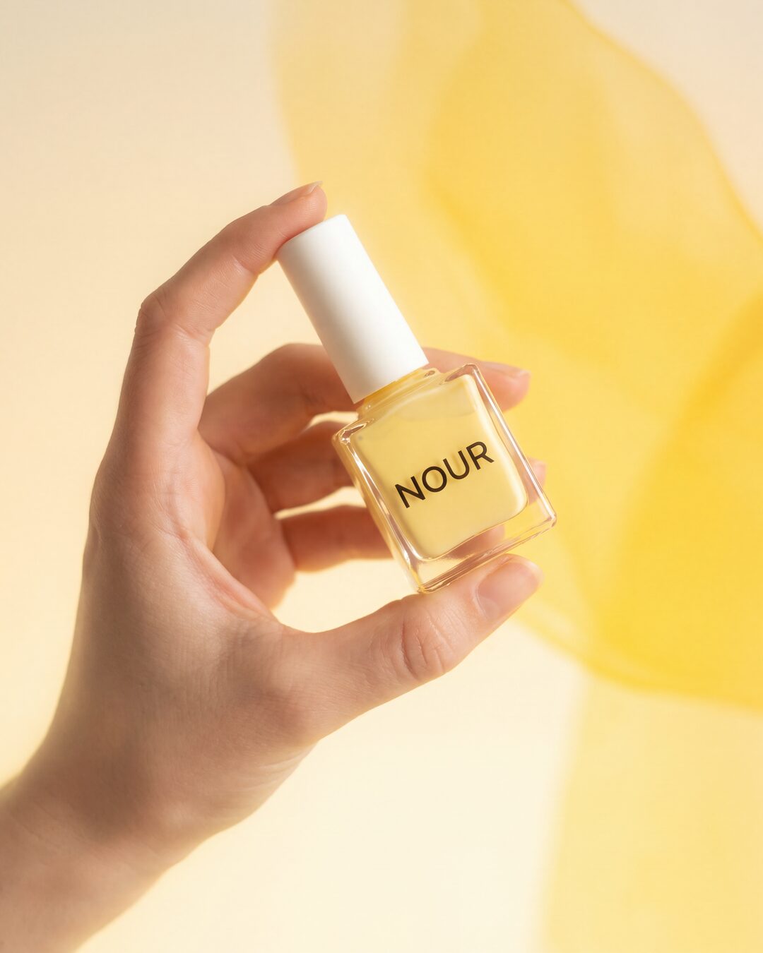
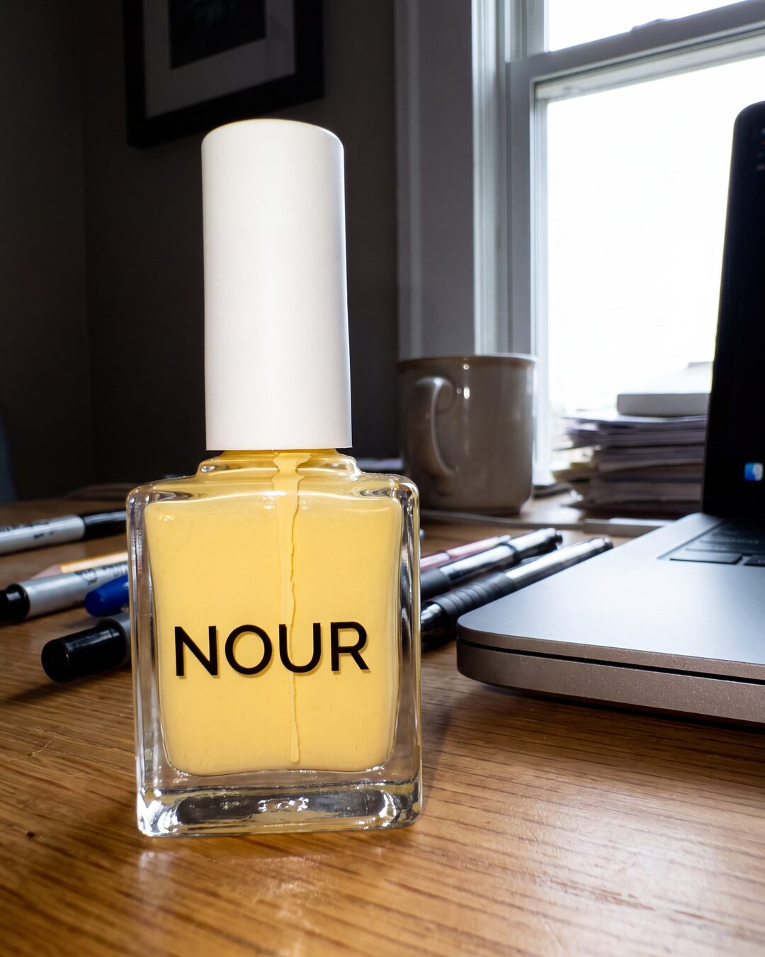 1 · Photo inOne photo of your product3 · The picture4K, campaign grade
Your photo
How it was made
1 · Photo inOne photo of your productThe recipe
2 · The briefUse the uploaded product photo as the sole product identity reference. Preserve the exact product shape, proportions, cap or lid design, branding, label placement, typography, materials, textures, colours and every packaging detail from the reference, and integrate the product naturally into the scene described below. COLOUR LAW: the campaign colour is the product's signature colour, the one colour that identifies it (its lacquer, glass, acetate, liquid, contents or label accent); neutral black, white, silver, gold and clear glass never count. Every coloured element of the scene named below is built from that one colour: the light, the backdrop gradient, the props. A red product makes a red scene, a green product a green scene, a blue product a blue scene. The product itself is never recoloured.
Create an ultra-premium dreamy beauty editorial built around the uploaded product. A delicate hand with soft natural skin enters from the left side of the frame, elegantly holding the product between the fingertips and thumb. The product sits in the upper-centre area of the composition, tilted diagonally about 20 to 30 degrees clockwise, its branding turned to the camera. The hand grip is designed around the uploaded product's true dimensions, proportions, silhouette, width, height and shape so the interaction is completely natural and physically believable: fingers wrap the product with proper pressure points, contact shadows, subtle skin compression and authentic ergonomics. The product keeps its exact packaging, branding, label design, cap shape, proportions, materials, textures and colours with no redesign or reinterpretation. The whole image has an ethereal soft-focus luxury beauty aesthetic created through diffusion-filter photography: blooming highlights, dreamy haze, subtle lens diffusion, gentle glow and delicate atmospheric softness. The background is a smooth gradient built entirely from the campaign colour, from its palest warm tint into its full saturation, with a large translucent wash of the same colour occupying the upper-right portion of the frame and softly bleeding into the background. Extremely shallow depth of field creates a floating dreamlike feeling where the hand stays recognisable but softly blurred while the product remains the primary subject with slightly stronger clarity than everything around it. Lighting is soft, warm, romantic and highly diffused, like luxury skincare advertising photographed through premium diffusion glass. Highlights bloom gently without clipping, shadows stay minimal and creamy, skin appears luminous and velvety. Keep the exact minimalist composition with no additional props, no text overlays, no environmental elements and no distractions. The mood is airy, luxurious, intimate and modern. Realistic optical blur, natural lens softness, subtle film grain, delicate glow, premium skincare campaign aesthetic, luxury advertising quality, medium-format camera look, high-end commercial beauty photography, physically accurate lighting, realistic skin texture beneath the diffusion, authentic shadows, no AI artifacts, no distorted fingers, no warped product geometry, no copy-paste appearance, no floating product. The final image looks like a genuine luxury beauty campaign shot in-camera through professional diffusion filters with the uploaded product photographed as part of the original shoot.3 · The picture4K, campaign gradeNotes 0
No notes yet. Say something to OBJEKT.