

Photography / Held
Product photography with hands
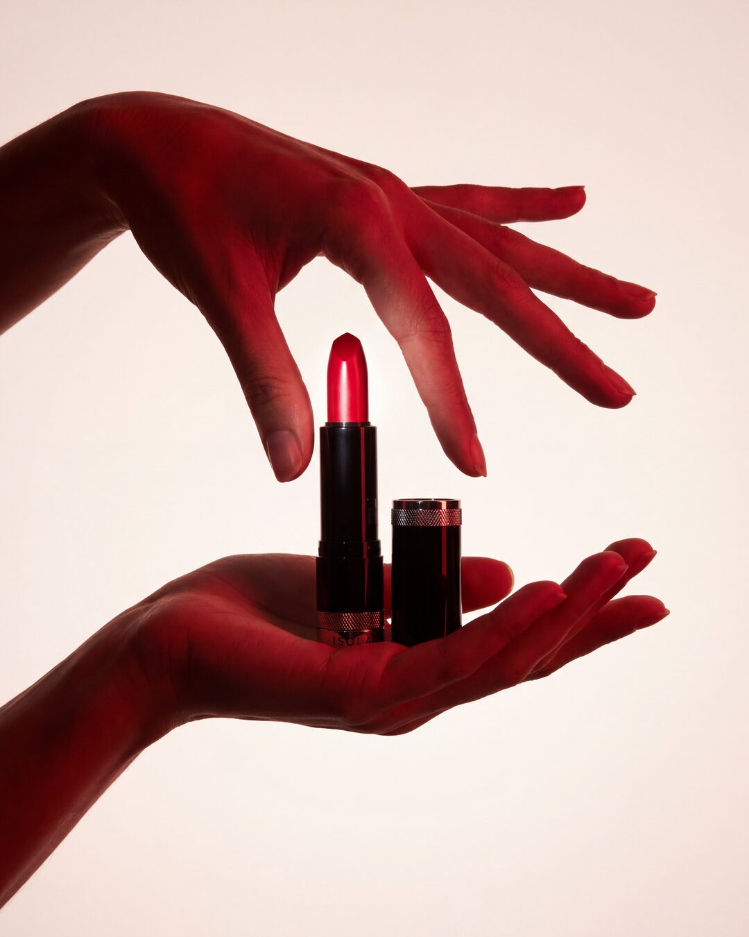
Two hands present your product under gel light in its own colour. The product stays the brightest thing in the frame.
Held
Two hands present your product under gel light in its own colour. The product stays the brightest thing in the frame.
Use the uploaded product photo as the sole product identity reference. Preserve the exact product shape, proportions, cap or lid design, branding, label placement, typography, materials, textures, colours and every packaging detail from the reference, and integrate the product naturally into the scene described below. COLOUR LAW: the campaign colour is the product's signature colour, the one colour that identifies it (its lacquer, glass, acetate, liquid, contents or label accent); neutral black, white, silver, gold and clear glass never count. Every coloured element of the scene named below is built from that one colour: the light, the backdrop gradient, the props. A red product makes a red scene, a green product a green scene, a blue product a blue scene. The product itself is never recoloured. Create a luxury editorial campaign photograph of the uploaded product held between two human hands. Composition is a clean vertical portrait format with the product centred between the hands. One hand enters from the top of the frame, palm facing downward with fingers elegantly spread and slightly curved around the product without gripping it aggressively. The second hand enters from the bottom of the frame, palm facing upward, gently cradling and presenting the product. The hands feel expressive, sculptural and editorial, creating a visual frame around the product. Adapt the hand positions, finger spacing, grip distance and hand proportions to the product's real size, width, height and silhouette so the interaction looks completely natural and physically realistic; never force the product into the dimensions of another object. The product must feel genuinely held within the scene, never inserted afterwards. Lighting is highly stylised luxury beauty advertising: a deep monochromatic wash of the campaign colour from strong coloured gel lights across both hands, creating rich shadows, dramatic contrast and sculptural depth while preserving realistic skin texture. The product remains the brightest object in the composition, standing out against the coloured atmosphere. Background is a seamless studio backdrop with a subtle warm off-white to pale tint of the campaign colour, softly illuminated with gentle falloff, no visible seams, props, furniture or distractions. Keep extensive negative space around the hands and product for a premium minimalist editorial feel. Camera angle is straight-on at product height, medium telephoto perspective, luxury commercial photography. The product is perfectly centred vertically and horizontally; the hands occupy the upper and lower thirds and guide attention toward the product. Shadows are soft but defined, with realistic light wrapping around fingers and product contours. Reflections, highlights, edge lighting, ambient colour bounce and contact shadows behave according to the actual material properties of the uploaded product, with realistic optical interactions between skin and product surfaces. Colour grading is cinematic luxury advertising built from the campaign colour: rich tones, warm highlights, deep shadows, subtle contrast. Skin appears realistic and premium, never plastic; the hands look like those of a real professional model photographed for a luxury campaign. Ultra-photorealistic studio photography, high-end editorial retouching, medium-format camera quality, 100MP detail, natural skin texture, physically accurate lighting, no AI artifacts, no warped fingers, no distorted hands, no extra objects, no additional props, no text overlays, no graphic elements, no floating objects, no copy-paste appearance: only the uploaded product, seamlessly integrated into this exact hand composition, in its own colour.
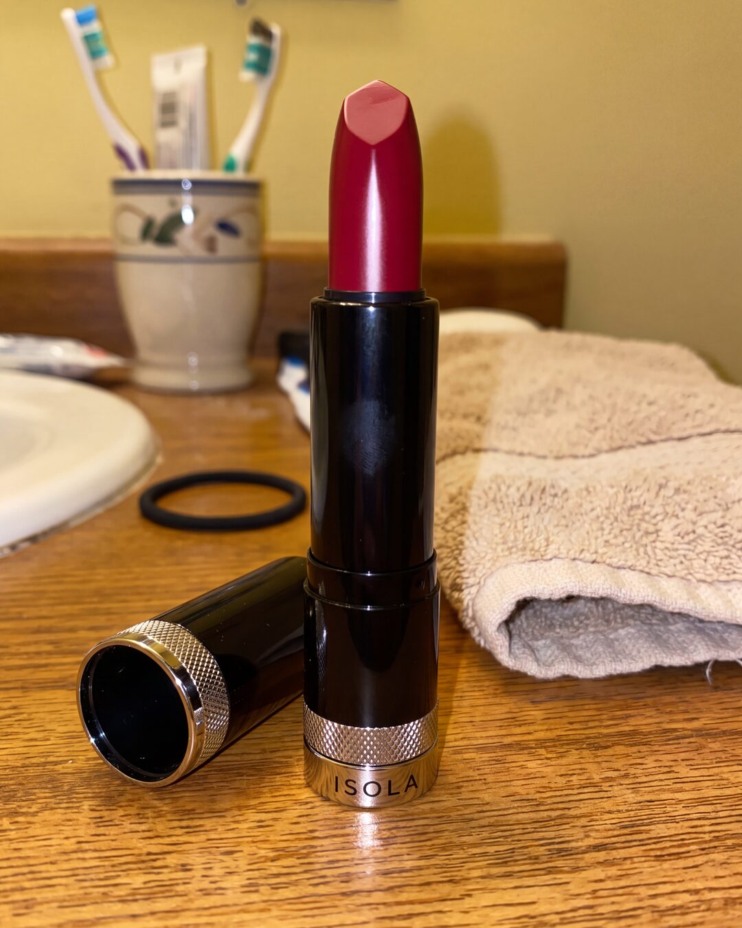
- Open Generate, upload a clean photo of your product, pick Nano Banana Pro.
- Paste the prompt and run once at 4K. The scene reads the product's colour and lights the hands with it.
- Want a different colour world? Add one line: 'the campaign colour is deep green'.
- The hero still of a launch
- A beauty or fragrance campaign frame
- The first slide of a product carousel
- A photo with the label facing the camera keeps the lettering sharp.
- Tall products fill the frame best; small ones read better with 'shot closer'.
- Very small printed text can soften; crop the photo tighter and run again.
Make it with your own photo
Bring a clear reference photo. The recipe supplies the direction; you choose the image size and check the credit cost before generating.
- The hero still of a launch
- A beauty or fragrance campaign frame
- The first slide of a product carousel